
Even after all this time, every quilt brings lessons with it.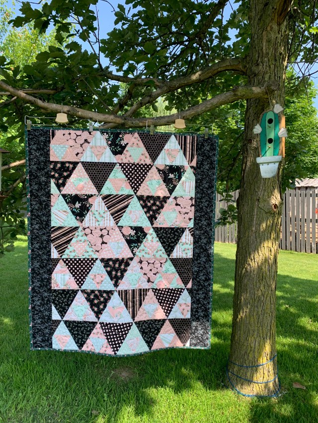
Remember when I wondered if this was too busy? I think I was right. But did I listen to my gut? Nooooooo! I forged ahead anyway.
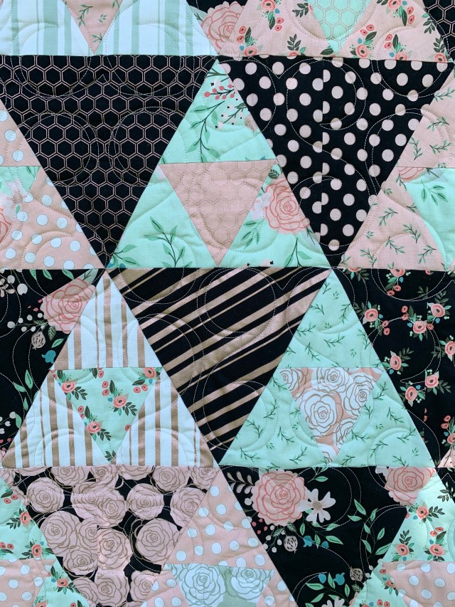
A more surprising lesson, was how well old 80s prints from the deep stash worked with this current layer cake.
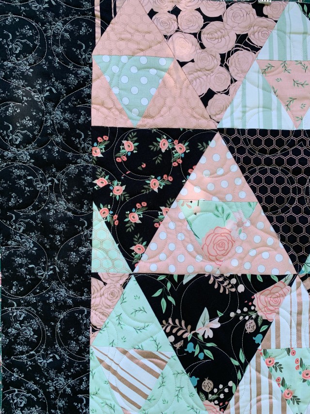
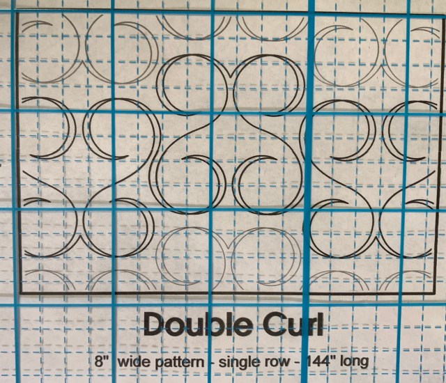
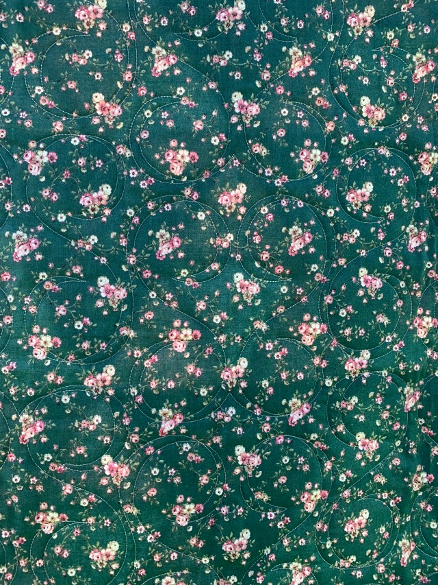
I used the above panto from Urban Elementz and I think that worked well here. I like the curvy quilting with the straight lines of the triangles. Another old print for the back and binding.
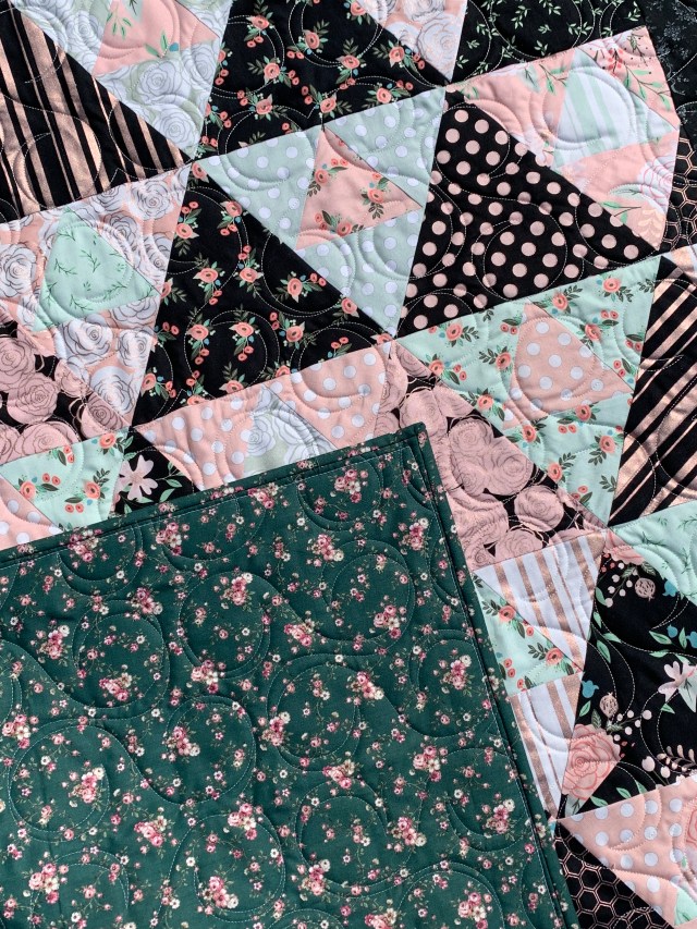
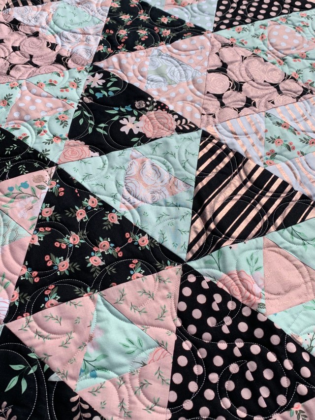
I’m not fishing for comments here, just musing on lessons learned. This isn’t my favorite quilt. So, I think it’s worth pondering why. I think part of the reason is that it is just not a “me” quilt. I love these fabrics, but in general, I’m not a floral girl. I think I would have liked this better if I had added a solid to give those beautiful prints some breathing room. That would have eliminated the need for the side borders as well. They do the job, but they are just okay.
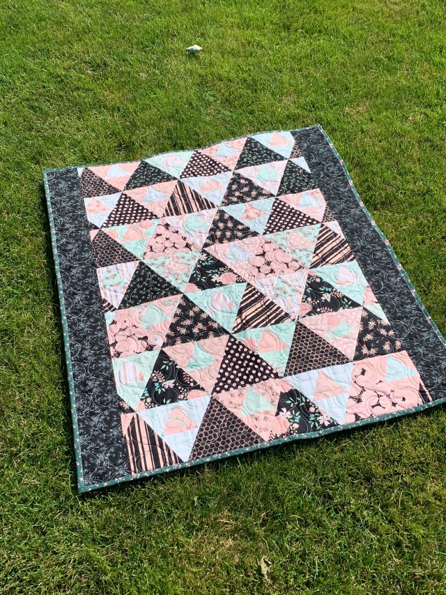
In the end, finished is better than perfect. I’m pretty sure I can find a home for it.
Have a great day!
Linking up with Confessions of a Fabric Addict
This post contains affiliate links.


If it bothers you enough to experiment with you could perhaps put black quarter inch bias tape over each of the seams and a floral applique on those side seams. Some green beans tape and raw edge applique broderie perse style flowers and leaves. It could be stitched right on to of the finished quilt adding more quilting to it.
I think it is a great finish!
The prints are a bit busy, but I think it looks good. I’m not a big fan of florals either. I do like the side borders and the quilting motif.
I think it is beautiful. I love how all the prints work
together and also your color layout!
Katy,
You have a great finish here, and I am sorry you are not loving it….but I am glad you forged ahead and brought it to a finish!
I don’t use much pink in my quilts… Don’t know why…. I much prefer blues and creams….that being said, I like the way you have used the pinks in this quilt. The contrast with the dark fabrics really works.
Thanks so much for sharing this quilt with your blog readers, and for your honesty about it not being a favorite. Maybe you will come to like it, with time….if not, you have a great little quilt for your “to be gifted” inventory!
Here’s to a great weekend….and moving on to other quilt projects!!
Oh I just noticed…the fabric is shiny. I love sparkles 🙂
I’d happily take it off your hands any floral and shiny fabric that you dislike :-p
katy, me thinks the word you were really looking for was ‘contrast.’ i think that is more of an issue than the busyness of the fabrics. the large tris contrast perfectly. now the center small triangles get lost (which is great when that is the look you are after). i’m very sure someone will love this quilt even though you don’t. you did learn a lesson and that is always good. maybe you could just lay some darker tris on those little center tris to see what it looks like. i am NOT suggesting that you remake this quilt. it’s just an experiment. jmnsho. once a teacher, always a teacher, i guess. no offense meant. i like the quilt. patti in florida
And for all those reasons it makes a perfect charity quilt. I believe that as long as the recipient loves it, not everyone needs to love it. Honestly, I love the contrast between black/navy and soft florals. Oh and I do love floral prints – the brighter the better.
Actually, I like it, and those are not my colors, at all. Somehow, though, it’s a pretty, feminine quilt. I do think you will find a home for it. I agree, that every quilt teaches us something, and that is the joy of creating! Enjoy your weekend, Katy!
I think it turned out very pretty! Hugs,
Hi Katy! I’m sorry you’re not a huge fan of this quilt, because I found it to be quite striking. I like the dark border you chose, and while I am not a fan of floral prints at all, I really enjoy everything about this quilt. When you first shared the process of making it earlier this week it has remained in my mind. Both the process and the fabrics keep popping up, so I know I’m going to have to give it a try sometime soon. Can’t wait to see what’s next. ~smile~ Roseanne
Perhaps if you had added a softer border on the sides, say pink you would feel differently. There is nothing wrong with it it’s a great finish. Funny how the fabrics themselves turn us off in projects sometimes. As a rule I steer away from bold prints but am trying to step outside my comfort zone with this. Not everyone likes the soft chalky colors that i prefer. Again, its a great finish.