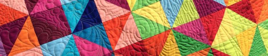
I haven’t forgotten these! I just haven’t gotten around to doing anything with them. But I’ve started auditioning sashing fabrics. These two are front runners. The first is a Minnick and Simpson print.

This next one is French General.

I think I prefer the first, but I’m not sure I have enough. My original thought was to make all the sashings different, but I think having them the same pulls it together. I do like the lighter look.
Time to try a few more, I think. Have a great day!


I like the lighter sashing too! Can you make a narrower sashing to stretch it out further?
I guess I’m opposite-I like the second choice for sashing. It makes the white background on the blocks pop, almost like using black with bright colors. What ever you choose will be great!
I like the first one too!
I like the first one, too. But if you don’t have enough you use the darker fabric around the outside, like a frame.
I think I agree. With the second version, the eye tends to go to the sashing rather than the little churnies (at least mine do).