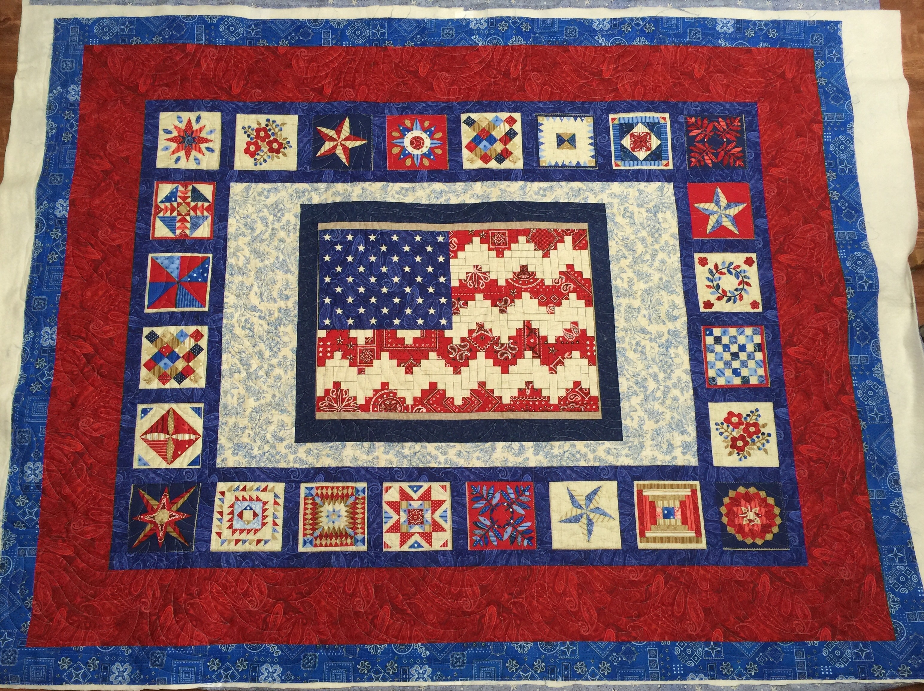
As promised, here is my post explaining my thought process in choosing the quilting design that I did for this top. Here is a photo of it unquilted. I left it hanging like this for a few days as I pondered how to quilt it. Sometimes, I know immediately what I want to do with a quilt and sometimes I just don’t!
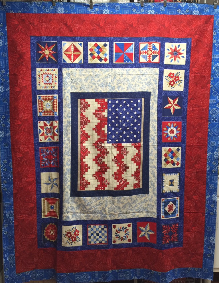
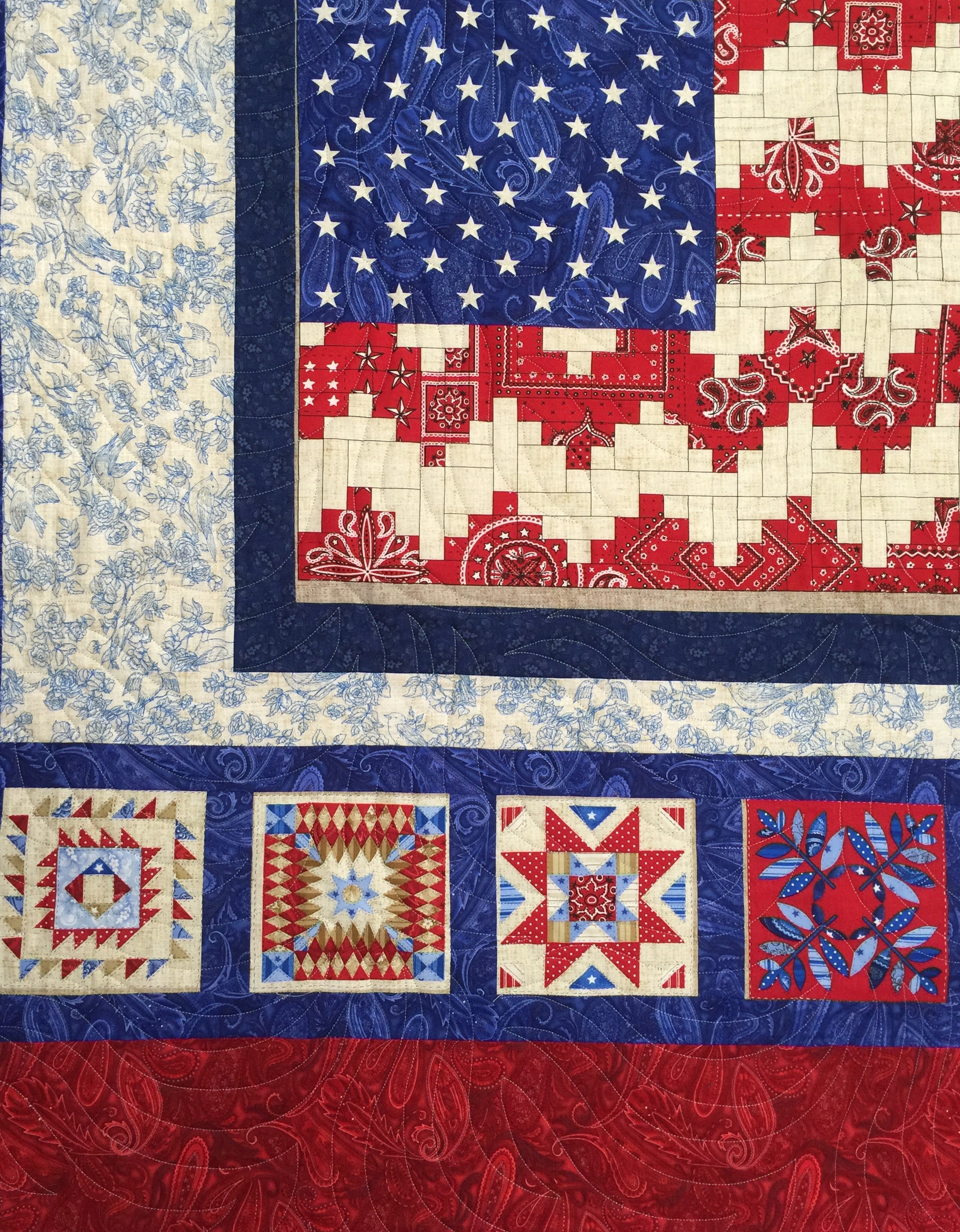
My first thought was to custom quilt this. I often do that with tops that have printed panels in them. In this case, the flag is preprinted and the little blocks around the edge are as well. Such a great use of fabric! I loved this top!
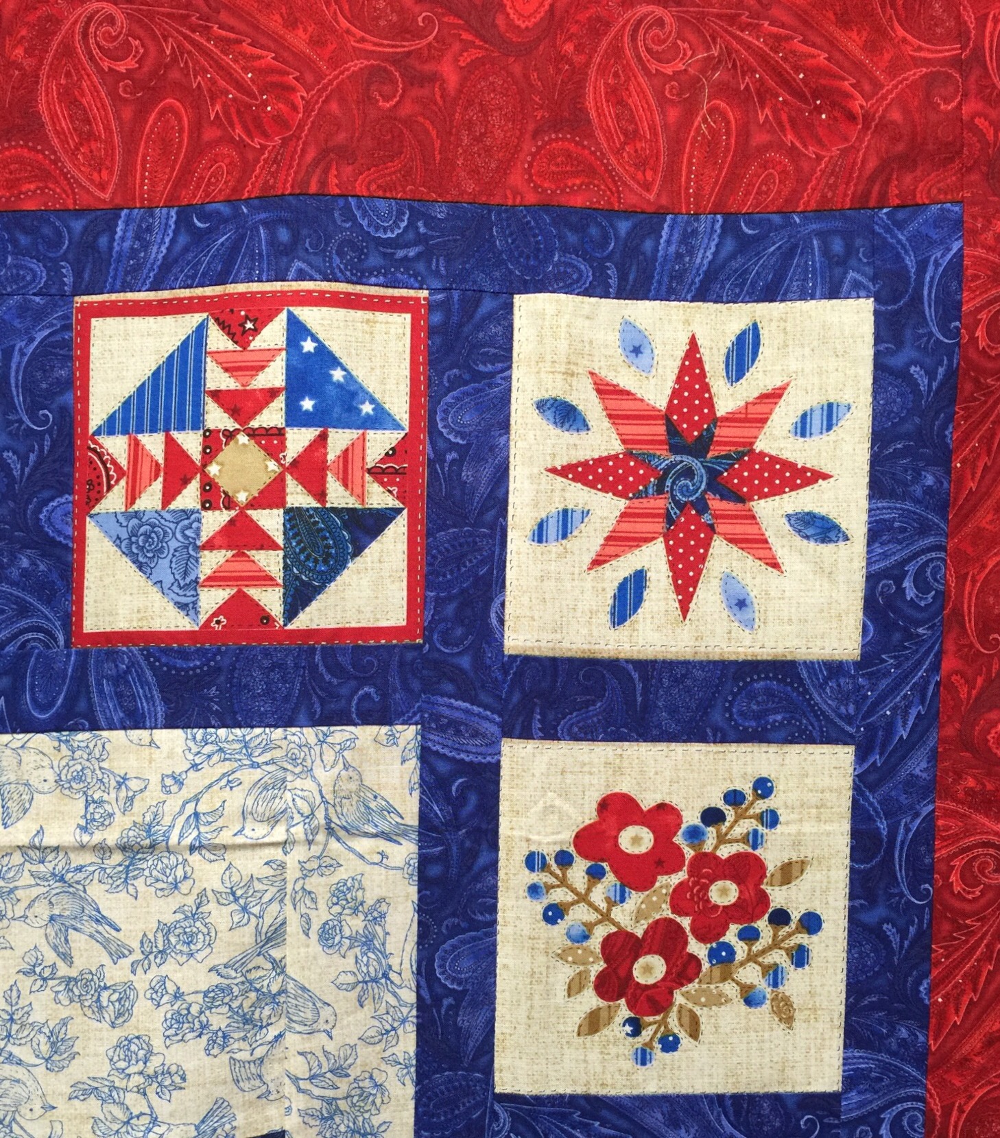
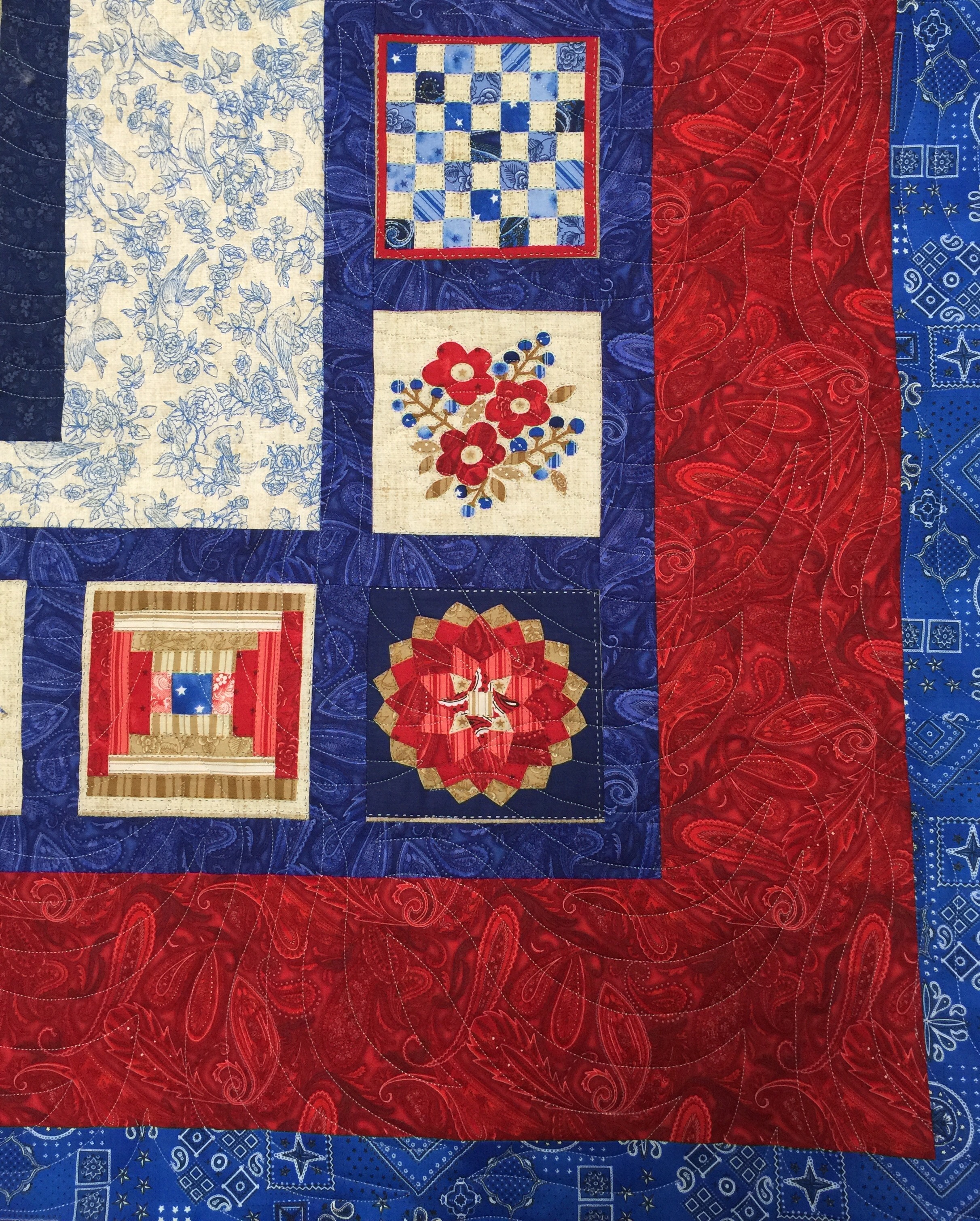
But the blocks left me perplexed. They are not big. The “pieces” are quite tiny. And yet, the blocks themselves are way too big to leave completely unquilted. Stitching “in the ditch” around each piece was really not an option. It would have taken forever and the quilting would have been very dense. But those borders….I had all kinds of ideas for custom quilting those!
I just couldn’t reconcile the two in my head. I asked some other long arm quilters of QOVs and one lady said she would use a patriotic edge to edge or pantograph design.
Hmmm….I really hadn’t considered using a pantograph until that point, but that plan certainly fit with my timeline! I have one patriotic panto. It says Honor, Bravery, Valor, and Courage on it. It is most definitely directional. But what is the top of this quilt? According to the rules of displaying flags, the blue field should always be to the upper left. That means the quilt is right side up in this orientation.
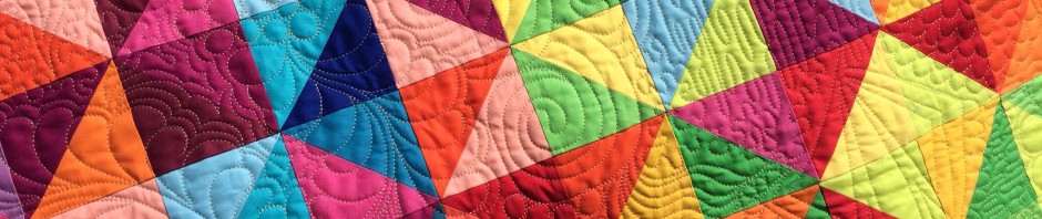
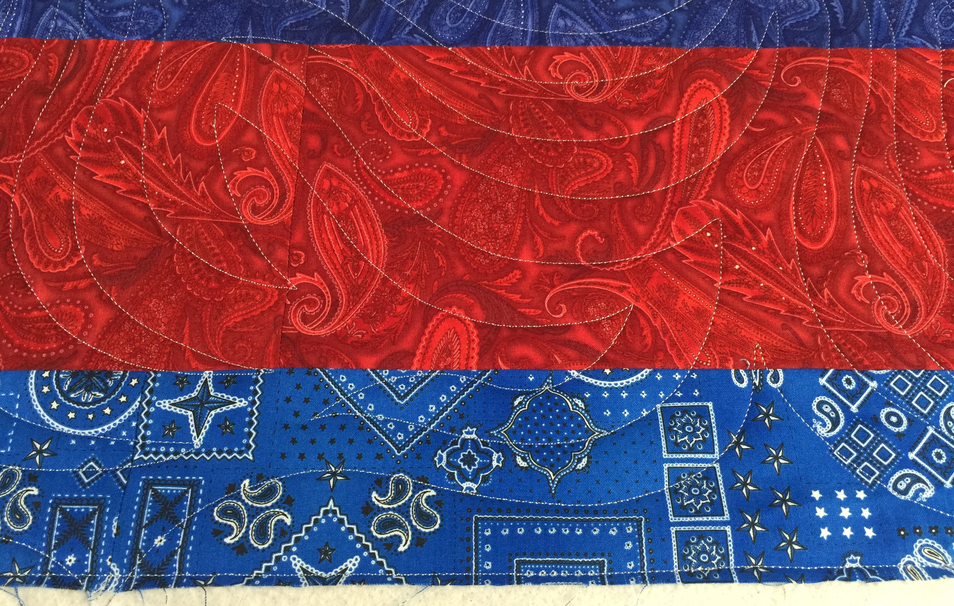
But the recipient might not see it that way. Since it wasn’t abundantly clear, I felt a directional pantograph was not the answer. I went looking for something that was definitely NOT directional. I also wanted something that would be more of a background design. Something that would allow you to see the printed blocks with out conflicting. I also didn’t want a design where you could discern specific elements. I wanted to keep the focus on the pattern of the top, not on the quilting. I chose this:
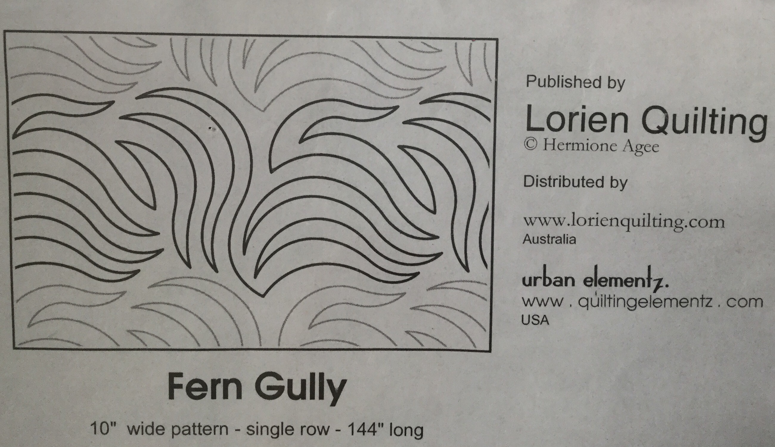
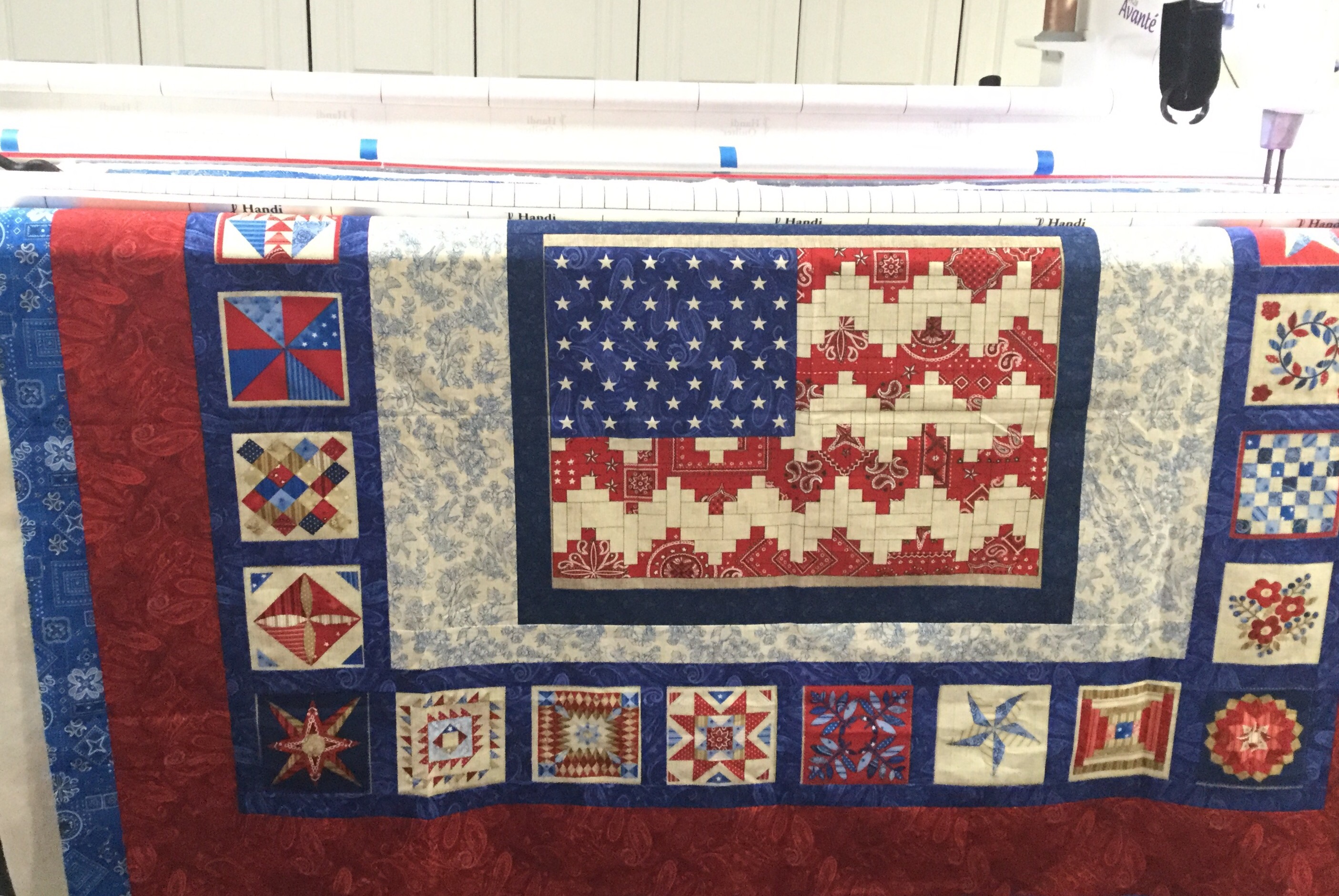
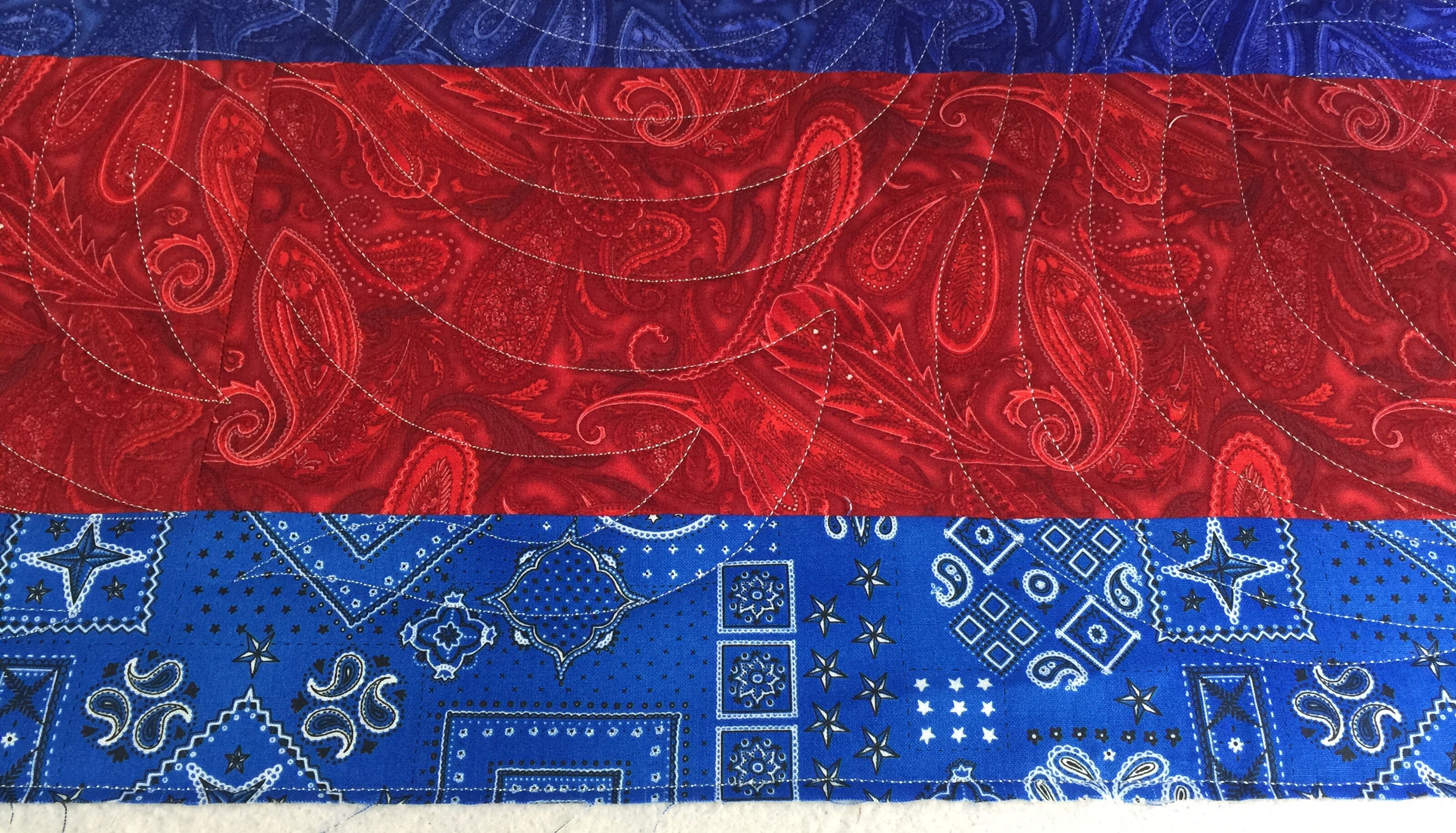
It reminded me of the stripes of the flag waving in the wind. It looks good in either orientation. It shows up well and adds a design element in the unpieced borders, but you really don’t notice it at all in the blocks.
I think you can see what I mean in the photos below. I used a light gray thread on the top and back.
And here is another little timesaver tip for you. When I finished the last row of the panto, I had just a small bit left unquilted.
Instead of realigning the whole thing and quilting a partial row, I just filled in with freehand work.
I don’t think anyone will ever notice. Here is one last look at the completed quilt in its entirety.
If you hung in there with me for this long, thanks! And have a great day!


Thanks for the tip about freehanding the last row. They can take a very long time to set up and re write. And you are right – no one will ever know. It’s a beautiful quilt.
Amazing how the quilt pattern adds to the quilt without obscuring the detail and symmetry of each of the little blocks. Very good choice!
That was a tough one, Katy! You put a lot of thought (and love) into it. The panto you selected was perfect. Have a glorious weekend.
Fern Gully is a great panto – my long arming friend used it on a couple of mine and it washes/wears very well. Good choice! (thanks for sharing your process)
It was fun to hear your thought process. Always wondered how you came up with quilting just right for each quilt top. Guessing it’s more challenging when each top is not something you made and perhaps thought about while piecing it.
Inside the mind of a longarmer…it’s pretty complicated in there! Thanks for the insight into how you choose quilting designs.
I think the quilt is wonderful and so is your quilting! Have a good weekend. Hugs,
Love the panto you chose… and how it finished this quilt so nicely and timely as well!