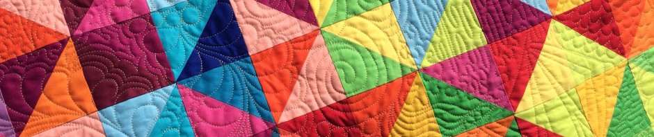
My design wall has gone from this:

To this:

The above two photos were taken minutes apart and have had no filters or editing. Can you believe the difference?
I had a little chat with Daughter #3 recently about the best background for photographing quilts to get accurate color. Being a photographer, she’d suggested gray.
I started looking at Goodwill for something gray to try out and found this.

A week later, I found another one just like it! I really need one more, and I can buy one on Amazon. But I’ll stalk the Goodwill stores nearby first.
I can’t believe how much better my photos are turning out with this change in background. Who knew? Apparently, my daughter did. Smarty pants.
Have a great day!


No way! Thanks so much for sharing this information with us. I’m going to give this a try. I always struggle getting good photographs. {{Hugs}} ~smile~ Roseanne
Wow, what a difference! Thanks for the tip 🙂 I currently have a white flannel sheet covering my design wall but maybe I should get a gray flannel sheet to pin up when I want to take photos💡😄
Doh! I’m just gathering the materials to make a design wall – I bought a cream coloured flannel sheet… That will look better on the wall (my sewing room doubles as a guest room) but maybe I could pin a grey sheet over the top when I’m photographing my quilt blocks…. Thanks for the useful tip!
I sometimes lay a strip of gray fabric across the item I’m photographing and focus the camera on it and pull away the strip and snap the photo. That only works on things you are an arms length away from though.
I have med/dark gray flannel on one 4′ x 7′ design wall but prefer white when I’m actually designing a quilt. I wonder if you will like working on the gray.
You’re right! It made a huge difference!
Kathy, gd morning. What a huge difference between the two. Thank you for sharing