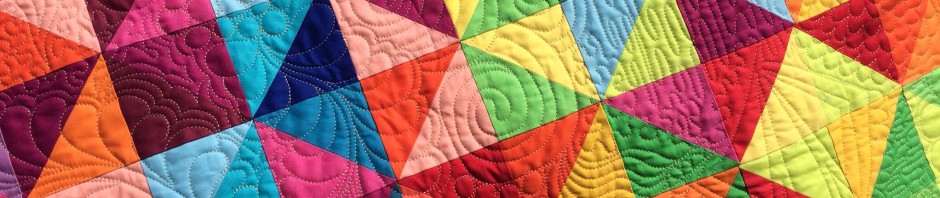
I’ve been thinking about the top I showed yesterday. There is something that bothers me, and I think I’ve identified the issue. 
It’s this. These cornerstones bother me.

I’m thinking about racing them. Perhaps a solid blue?

Or yellow?

As a reminder, here is the full top.

Any ideas? Is it worth the effort of replacing these?
Have a great day!


How about a tan, Army colors 🙂 Green and tan would look great!
I love yellow, love green, and love them together. But, I like the blue best here; feel it would let the stars shine without distraction or competition.
I think you’ve got the right idea, maybe applique something else on top (on point like Audrey said would be really cool). But, sometimes I find that even when there’s a slightly “off” or oddball choice in a quilt, when it is all quilted and finished, the effect is muted and can be quite charming after all.
I would probably applique a smaller square ‘on point’ over the top of what is already there! If it bothers, you then its well worth the effort. The rest of the quilt is fantastic.:)
I think the yellow would be too noticeable, and the blue not quite right. Do you have cheddar?
You have to like it, at the very least, to want to do the quilting on it. It would be risky but have you considered tea dying the whole top? Everything would be affected but at least the stark white background of the cornerstones would work better with all the other fabrics. Good luck deciding what works best for you.
I love your quilt: Batik Rectangles! What size are the rectangles? Thank you!
I would but you don’t have to take the top apart. You could appliqué them on top of the squares already in place.
Now i like them;))) they are just funky enough to make this one a bit different…..
but then, that’s just me…hugs, Julierose
Ok for me I would like a color that would pop. A red tone. But than again the color you have around your stars may tone down the green and make your eyes focus on the stars.
The big thing is you have to be happy with it! If it is for you and it sits in a closet, or for someone you know and you always think what if. Change it. If not who ever receives it will be so happy to have it. It is the time and love you put in that counts.
Katy I agree that the cornerstones don’t fit with the rest of the quilt. I think the white background on their print makes the rest of the quilt look sort of dingy. I would change them. I personally don’t care for the yellow you show with the green and would choose something else.
Depends on whether it is a keeper or not, if it is a giveaway, leave as is. A keeper, replace the cornerstones.
I rather like it the way it is but if you’re sure you want to change the cornerstones, I think a medium solid in the same family as the borders would look best. And like Kathy D says, it depends on how you plan to use the quilt.
I would change them – they don’t seem to fit the rest of the quilt. I would cut a few squares of multiple colors you are considering, pin them all in place around the top, step back and see what makes you smile.
cornerstones look like a vintage sheet-does it feel like that? My vote would be cheddar~yellow doesn’t cut it in my book. IMHO
I agree that a solid would look better, though I’m not sure which would be best. Only you can say whether it’s worth the effort.
Guess it depends on how you plan to use the quilt. If you plan to keep it and see it often, make it pleasing to you. Agree with Karen about blue or yellow; what about cream or peach?
Looking at the whole top, I think the solid blue would be too heavy, and the yellow would not work either. Overall I think the squares you already have, provide a spot of fresh air to the solid green rails.
If it bothers you …. you should!!