I decided I needed to play with my blocks a bit to determine exactly what I didn’t like.
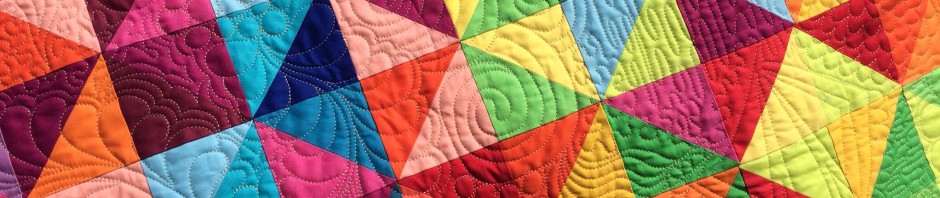
The first grouping uses high contrast in the circles and dark to medium on the edges.

This group is lower contrast as I removed all the lights.

Lights around the outside.

All lights in the middle.

Which would you choose?
Have a great day!


why not three parts without light, and only one (!) with a light
i like most the ones without light… but 1/4 with a light could have an intersting balance… a little bit light could be good… but this is only my idea.. and if a complete quilt… why not in one corner the one with the lights in the middle, make a mix! They are all nice.
I’m thinking since the lower contrast was what you first had in mind, go with that. The first grouping is pretty neat, too, though.
Love the colorful low contrast. There is still good contrast because of the colors used. In this case, I like the more saturated look. But that’s just me!
go with the lower contrast with lights removed
I like the lower contrast one. Fabrics are gorgeous
I like the lights on the outside. Makes the ” circles” pop.
I like both the High Contrast and the Lower Contrast. Can’t decide which one is my favorite.
I like the first grouping. 🤩
since you asked…the first grouping….i like the contrast…