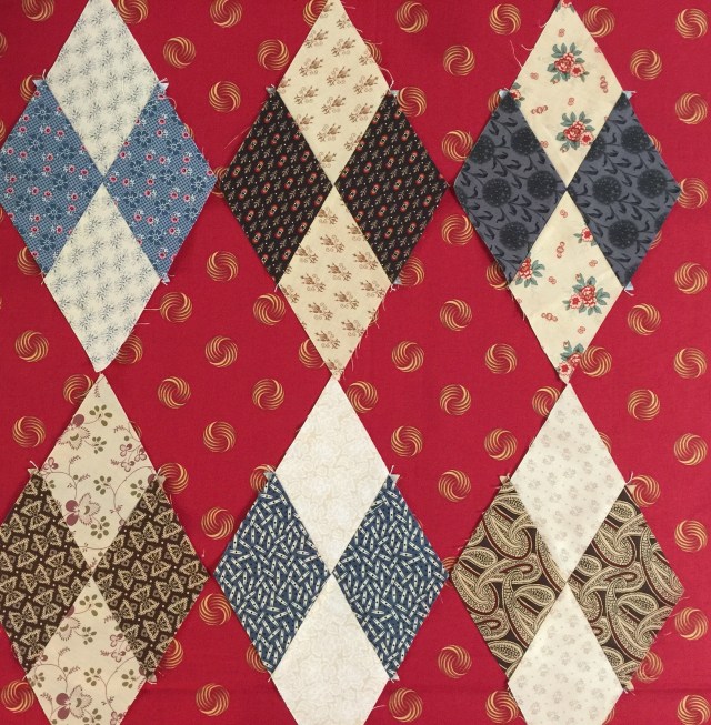
I decided to work on these blocks and realized I had made more than I thought.

I pulled some things out of my stash to audition as backgrounds.
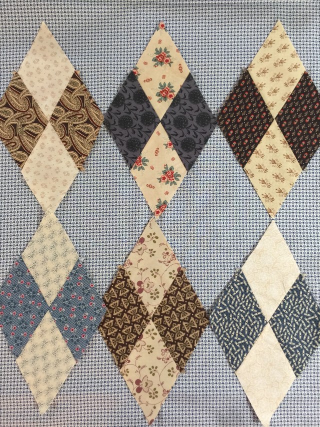
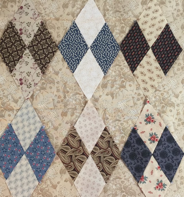
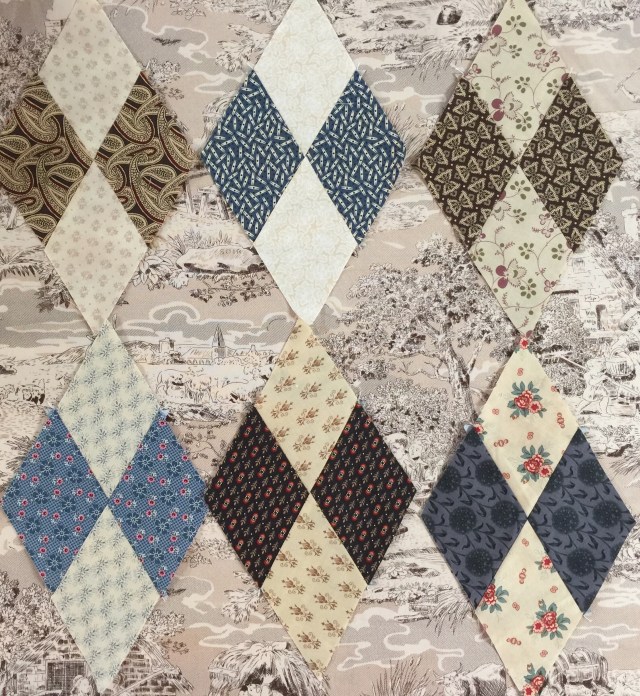
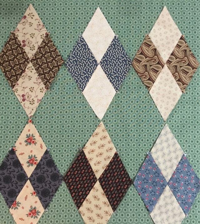
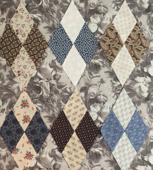
The beige-y ones blend too much. I’m leaning toward the green right now.
But of course, that could change!
Have a great day!


The green makes everything pop. The red always makes me think of… Christmas.
The beige-y ones do blend too much. You can never go wrong with red, though.
I love the third one from the top……
I love the blue.
Not that you need my opinion, but I agree with you about the green. The red is another possibility. It all depends on the look that you are going after. I think I favor the green because it doesn’t overpower the pieced diamonds. With the red you see the red diamonds before you see the pieced diamonds.
Red!
I love that green!
I also like the blue.
I’m with Karen…I like the red.
I’m different and I like the red 🙂
Yes, I love the green.
I love the red, but the green caught my eye also.
Green looks great. The diamonds do get lost in the beiges. The red looks rather interesting, though it might overwhelm the diamond blocks.
Green is my first choice as well.
I agree with the green; seems to work best.